Once XAI techniques are mastered, how exactly can we apply them? Well, the first thing to understand is that XAI applicability depends not only on the type of model or technique but also on the types of data. Typically, we see machine learning models applied to text, audio, image, or tabular data. The nature of these types of data differs substantially, which means that the explanations that we can extract are also different. For instance, images make intuitive sense from the way their information is structured – a cat looks like a cat regardless of who you’re showing it to. However, data such as text is random – the word “cat” only means cat because we all agree with that meaning. Therefore, machine learning models based on text data have to learn how these random conventions work, and XAI techniques applied to text also need to be able to simplify that process.
In this section, we look at examples with image and tabular data, given that they’re two of the most frequently used data types in XAI. We use LIME and occlusion sensitivity to understand how computer vision models identify animals and pictures of trash. We also apply SHAP to the same trash example and to handwritten digit recognition, one of the most traditional and widely used examples in computer vision. Regarding tabular data, we use ELI5 to understand how flowers can be identified from their petal measurement. We also determine what features need to change for someone to get a loan with counterfactual explanations, and we examine the most important characteristics to determine the value of a house with the California Housing Dataset and permutation feature importance.
This section isn’t exhaustive, and you should always be aware that each unique dataset may bring its own challenges in XAI. Some applications of machine learning, like reinforcement learning, may not even require training data. However, the examples below should give you a sense of how XAI looks in practice and what you should expect from successfully applying these techniques.
Explainable AI for image classification
LIME
Let us briefly refresh how LIME works. The method aims to provide local explanations for individual predictions of AI models. It approximates the behavior of the model around a specific input (for example, images of cats and dogs) by creating a simplified, interpretable model.
To work out the implementation of LIME, consider the ResNET50 model which is a deep convolutional neural network for image classification. We first load the model and create a LIME explainer object, which will be used to generate the explanations for individual instances. We’ll use a dataset from imageNet that compares cats and dogs.
import lime
import lime.lime_image
import numpy as np
from tensorflow.keras.preprocessing.image import load_img, img_to_array
from tensorflow.keras.applications.resnet50 import ResNet50, preprocess_input
import matplotlib.pyplot as plt

def preprocess_image(img_path):
    img = load_img(img_path, target_size=(224, 224))
    x = img_to_array(img)
    x = np.expand_dims(x, axis=0)
    x = preprocess_input(x)
    return x

model = ResNet50(weights='imagenet')
img = preprocess_image('sampleimage.jpg')
explainer = lime.lime_image.LimeImageExplainer()
explanation = explainer.explain_instance(
    img[0], model.predict, top_labels=1, hide_color=0, num_samples=1000
)
temp, mask = explanation.get_image_and_mask(
    explanation.top_labels[0], positive_only=True, num_features=10,
    hide_rest=True
)
plt.imshow(mark_boundaries(temp / 2 + 0.5, mask))
Then, we generate the explanation by passing the input data and the prediction to the explain_instance() method. The explanations from LIME for input images can be seen below:
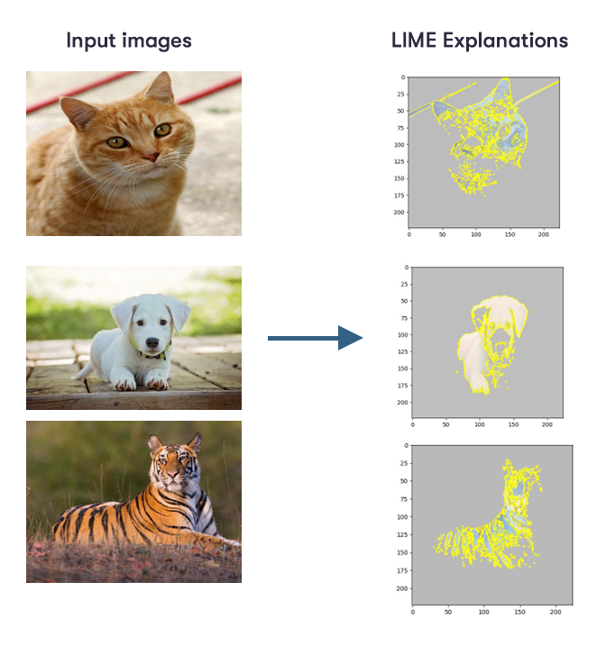

The figure above shows which shapes the model has learned as being relevant to the classification of each animal image, for example the stripes of the tiger.
Now, let’s look at another example below. This example uses a black box model for trash classification. The dataset consists of 2527 images showing litter objects from six classes: glass, paper, cardboard, plastic, metal, and trash (3).
import numpy as np
from lime import lime_image

explainer = lime_image.LimeImageExplainer()
image = np.asarray(image.resize((300, 300)))[..., :3]
image = image / 127.5 - 1.0
explanation = explainer.explain_instance(
    image, model.predict, top_labels=5, hide_color=0, num_samples=1000
)
temp_2, mask_2 = explanation.get_image_and_mask(explanation.top_labels[0], positive_only=False, num_features=10, hide_rest=False)
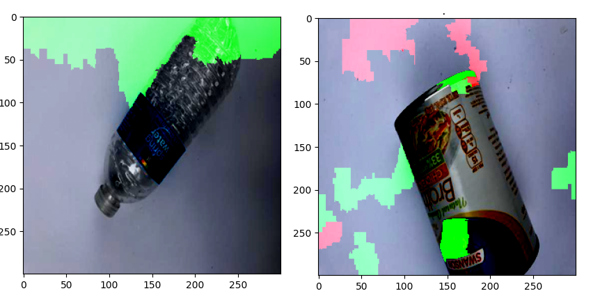

The figure above illustrates which parts of the two images the trained network identifies as most positive towards its prediction (green part) and which part as most negative (red part). It can be seen that the network focuses mainly on background parts, rather than on the objects, as one might intuitively expect. Knowledge of unintended behavior can help in the analysis of potential risks and is crucial for the application of such models in the real world.
SHAP
If you studied the Basics of Trustworthy AI course, you might remember the explainability method called SHAP that uses Shapley value (which comes from game theory) to assign importance values to features. For image classification, it’s useful to visualize these values as a heatmap to see which pixels contribute most to the model's predictions.
To visualize the SHAP method, we first load the MNIST dataset (a large database of handwritten numbers) and train a simple neural network. Then, we use SHAP’s ‘DeepExplainer’ to explain the model predictions on the test data and visualize the results using “shap.image_plot.
import shap import tensorflow as tf from tensorflow import keras
# Load MNIST dataset (x_train, y_train), (x_test, y_test) = keras.datasets.mnist.load_data() # Scale pixel values to [0, 1] x_train = x_train / 255.0 x_test = x_test / 255.0 # Add channel dimension to input data x_train = x_train.reshape(x_train.shape[0], 28, 28, 1) x_test = x_test.reshape(x_test.shape[0], 28, 28, 1) # Convert labels to one-hot encoding y_train = keras.utils.to_categorical(y_train, 10) y_test = keras.utils.to_categorical(y_test, 10) # Load the pre-trained model model = keras.models.load_model('mnist_model.h5') # Use SHAP to explain the model's predictions explainer = shap.DeepExplainer(model, x_train[:100]) shap_values = explainer.shap_values(x_test[:5]) shap.image_plot(shap_values, -x_test[:5])
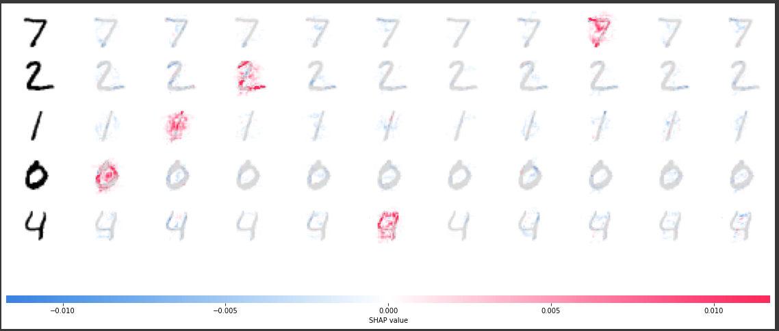

The model trained above has ten output classes, one for each of the ten digits. For each of these classes, the feature importance values for each of the five input images are visualized (the left column shows the image of the digit that’s fed into the network while all other columns show the feature values from the prediction of digit 0 to the prediction of digit 9). It can be seen that, especially for the correct prediction classes, pixels are highlighted that are relevant to the prediction of that particular class. Moreover, not only pixels on the digits themselves are highlighted, but also pixels in the surrounding area. For example, the interior of digit zero seems to be important for the trained network to predict class zero, which makes sense since it’s a way to distinguish a zero from an eight.
Here’s another example to visualize the working of SHAP where we apply SHAP on a model for trash classification.
import shap
import numpy as np
import matplotlib.pyplot as plt
from keras.models import Sequential
image = np.asarray(image.resize((300, 300)))[..., :3]
image = np.expand_dims(image, 0)
image = image / 255.0
background_imgs = self.build_background_for_computing(test_images)
explainer = shap.DeepExplainer(model,background_imgs)
shap_values = explainer.shap_values(image, check_additivity=False)
self.plot_explanations(shap_values, image)
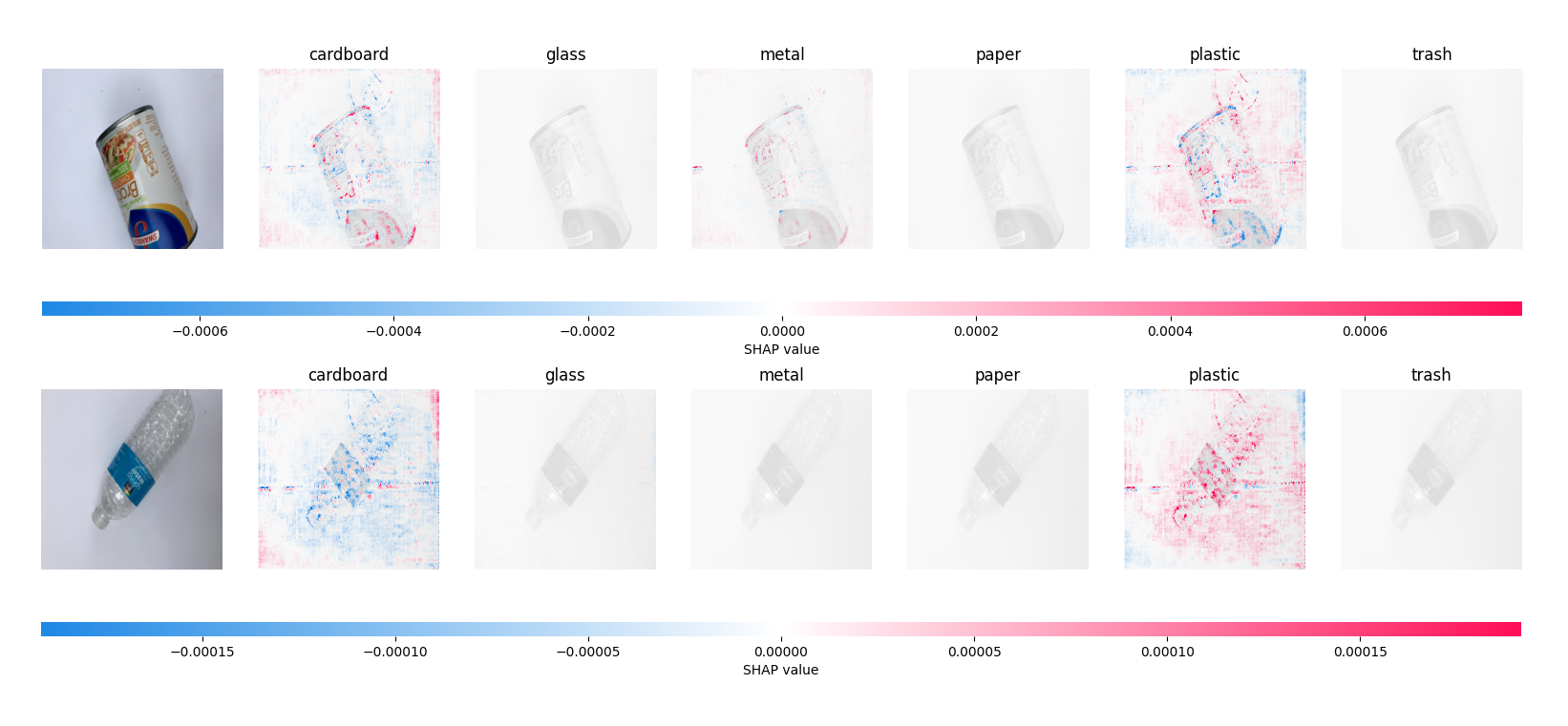

The figure illustrates which parts of the images contribute most (red coloured) and which least (blue coloured) to the model’s predictions of the two images shown on the left to a particular class. Considering the image of the plastic bottle for instance, a lot of pixels are highlighted in red for the correct prediction class ‘plastic’. This means that these pixels contribute a lot to the model’s prediction of the image being from the class ‘plastic’.
Occlusion sensitivity
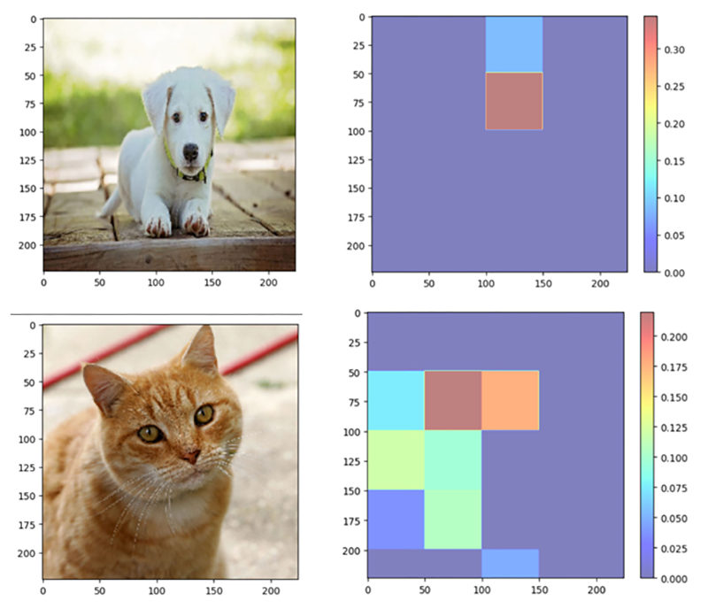
Occlusion sensitivity is a model-agnostic and visual-based explainability method that is typically used to explain neural networks working with image input. The method applies an occlusion mask over a specific area of an image, gathering the model output for the partially occluded image, and then repeating this while moving the mask over the image. This way, it’s possible to detect which of the occluded areas have the largest impact on the model outcomes. The change in the model's prediction of the occluded input image from the original input image is conveyed graphically using a saliency map or heatmap and numerically using measures of feature importance.
To demonstrate the working and implementation of occlusion sensitivity, we’ll use a pre-trained VGG16 model for image classification (4) and load a sample image with it. After pre-processing the image, we define the size of the occlusion, which establishes the dimensions of the occlusion mask that will be used on the picture. Setting a section of the image to zero allows us to loop across it and produce an occluded image. Next, after obtaining the output probability for the partially occluded picture, we determine the difference between the output probabilities for the occluded and original images. We record these variations in an occlusion map. The locations that, when occluded, have the biggest influence on the model's forecast are then highlighted on the occlusion map using a color bar.
Note that the output is the occlusion map, which shows which parts of the image are crucial for the model's prediction. The occlusion map's brighter portions denote places that are more crucial for the model's prediction, while the darker parts denote less crucial locations.
Let’s look at an example!
import numpy as np
import matplotlib.pyplot as plt
from keras.applications.vgg16 import VGG16, preprocess_input, decode_predictions
import keras.utils as image

# Load the pre-trained VGG16 model
model = VGG16(weights='imagenet')

# Load the example image
img_path = 'image.jpg'
img = image.load_img(img_path, target_size=(224, 224))
x = image.img_to_array(img)
x = preprocess_input(x)
plt.imshow(img)

# Define the occlusion size
occlusion_size = 50

# Loop through the image and perform occlusion sensitivity analysis
output_size = model.predict(x.reshape(1, 224, 224, 3)).shape[1]
occlusion_map = np.zeros((224, 224))

for i in range(0, 224, occlusion_size):
    for j in range(0, 224, occlusion_size):
        # Create the occluded image
        occluded_img = np.copy(x)
        occluded_img[i:i+occlusion_size, j:j+occlusion_size, :] = 0
        # Get the output probability for the occluded image
        output = model.predict(occluded_img.reshape(1, 224, 224, 3))
        # Calculate the difference in output probabilities between the occluded and original image
        occlusion_map[i:i+occlusion_size, j:j+occlusion_size] = output[0][np.argmax(output)] - output[0][np.argmax(model.predict(x.reshape(1, 224, 224, 3)))]

# Plot the occlusion map
plt.imshow(occlusion_map, cmap='jet', alpha=0.5)
plt.colorbar()
plt.show()
The results from the occlusion map for a few sample images are shown below:

Explainable AI for textual/tabular data
ELI
ELI5 is an acronym for “Explain it like I’m 5." It’s a method of explainability that seeks to offer explanations for the choices made by machine learning models that are understandable to humans. It functions by dissecting intricate and enigmatic models into clearer, easier-to-understand explanations for non-experts. The ELI5 provides us with an explanation of how the weights of individual features in the model are assigned and how these individual feature weights contribute to the final prediction.
For instance, we trained a logistic regression model on the Iris dataset from Scikit-Learn. (Note that logistic regression is an inherently explainable “glass-box” model. In reality, it makes more sense to use ELI5 on a more complex black-box model.) The petal and sepal lengths of three distinct varieties of irises (Setosa, Versicolor, and Virginica) are included in this dataset. Samples are represented by rows, whereas the attributes Sepal Length, Sepal Width, Petal Length, and Petal Width are represented by columns. The code snippet is shown below:
import eli5
from sklearn.linear_model import LogisticRegression
from sklearn.datasets import load_iris
from sklearn.model_selection import train_test_split

# Load the iris dataset
iris = load_iris()

# Split the dataset into training and test sets
X_train, X_test, y_train, y_test = train_test_split(iris.data, iris.target, test_size=0.2, random_state=42)

# Create a logistic regression model
clf = LogisticRegression()

# Train the model on the training set
clf.fit(X_train, y_train)

# Use ELI5 to explain the model's decision-making process
eli5.show_weights(clf, feature_names=iris.feature_names, target_names=iris.target_names)
The results from ELI5 XAI are shown below in tabular form, where each individual feature contribution is mentioned:


From the table above, we can observe the order of important features that contribute to model’s prediction. It’s worth mentioning that the <BIAS> feature isn’t a feature of data and it’s an expected average score of the model’s predictions based on the training data.
Counterfactual explanations
We define the input features for the loan application – income and credit score – and train a random forest classifier for the loan status dataset. As seen from the code below, we train a simpler Decision Tree Classifier with income and credit score as the inputs and loan application acceptance (1 = accepted; 0 = rejected) as the output. Next, we load the trained model, define the desired output as 1, and create the counterfactual explanations for it using the ‘explain()’ method of the ‘CounterfactualExplainer’ object. The code snippet is shown below:
import numpy as np
import joblib
from alibi.explainers import Counterfactual

# Define the training data
X_train = np.array([[30000, 580], [40000, 550], [50000, 600], [60000, 650]])
y_train = np.array([0, 0, 1, 1])

# Train a decision tree model
model = DecisionTreeClassifier()
model.fit(X_train, y_train)

# Save the model as a joblib file
joblib.dump(model, 'loan_approval_model.joblib')

# Load the trained model
model = joblib.load('loan_approval_model.joblib')

# Define the predict function for the model
def predict_fn(X):
    return model.predict_proba(X)

# Define the input data and the desired output
input_data = np.array([[50000, 600]])
desired_output = 1

# Create a counterfactual explainer object
explainer = Counterfactual(predict_fn, shape=input_data.shape, target_class=desired_output)

# Generate counterfactual explanations for the loan application rejection
explanation = explainer.explain(input_data)

# Print the counterfactual explanation
print("Counterfactual explanation:")
print(explanation)
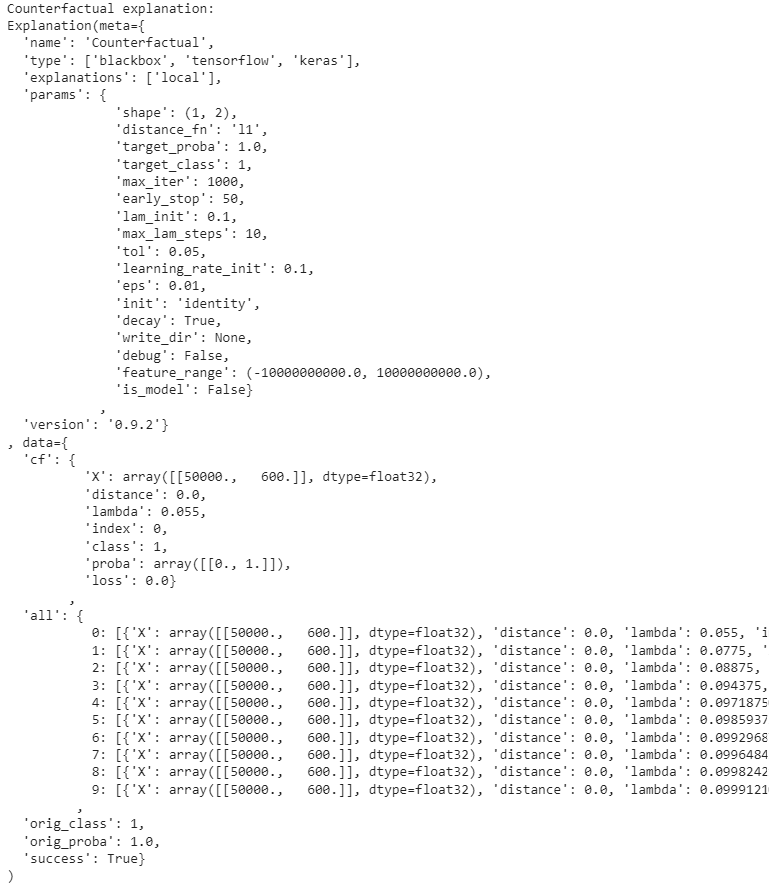
The counterfactual explanations for an ML model for a loan application acceptance/rejection look as follows:
As seen below, the output shows the counterfactual explanations generated for the given input data (50000, 600). Let’s break down the output:
meta– metadata about the explanation type and also the parameters.cf– provides information about the counterfactual instance.X– counterfactual feature values generated for the given input data.distance– represents the distance between the original data and the counterfactual instance.all– contains a dictionary with information about all the generated counterfactual instances.

Permutation feature importance
Permutation feature importance is a technique that computes the predictive power of each feature by randomly shuffling its values and observing the effects that this shuffling procedure will have on the prediction error. The main intuition here is that changing (or shuffling) the values of the less “important” features shouldn’t affect the prediction error in any significant way. Conversely, since the model relies heavily on the “important” features to generate its predictions, shuffling their values would result in a considerably increased prediction error (5).
The code snippet below demonstrates how permutation feature importance works. We used the California Housing Dataset from Scikit-learn (see also sensitivity analysis), which comprises housing prices together with related features such as population and median income of households (MedInc) to fit a random forest regressor model, and then used permutation importance to calculate the importance of each feature as shown in the box plot. Such a plot can be useful when an experiment (here, the calculation of the drop of the model’s score for each feature) is repeated several times and the median result, as well as the lowest and highest results, are of interest.
import numpy as np
import matplotlib.pyplot as plt
from sklearn.datasets import fetch_california_housing
from sklearn.ensemble import RandomForestRegressor
from sklearn.inspection import permutation_importance

# Load the California Housing dataset
california_housing = fetch_california_housing()
X = california_housing.data
y = california_housing.target

# Train a random forest regressor on the dataset
rf = RandomForestRegressor(n_estimators=100, random_state=42)
rf.fit(X, y)

# Calculate feature importances using permutation importance
result = permutation_importance(rf, X, y, n_repeats=10, random_state=42)

# Sort features by importance
sorted_idx = result.importances_mean.argsort()

# Plot feature importances
fig, ax = plt.subplots(figsize=(8, 6))
ax.boxplot(result.importances[sorted_idx].T, vert=True, labels=np.array(california_housing.feature_names)[sorted_idx])
ax.set_title("Permutation Feature Importance")
fig.tight_layout()
plt.grid()
plt.show()


The figure shows that the decrease in model score is highest for the MedInc feature, indicating that the model is most influenced by this feature. Therefore, this feature is considered to be the most important. The feature Population, on the other hand, shows the smallest decrease in model score and is, therefore, the least important for the outcome of the model's predictions.

